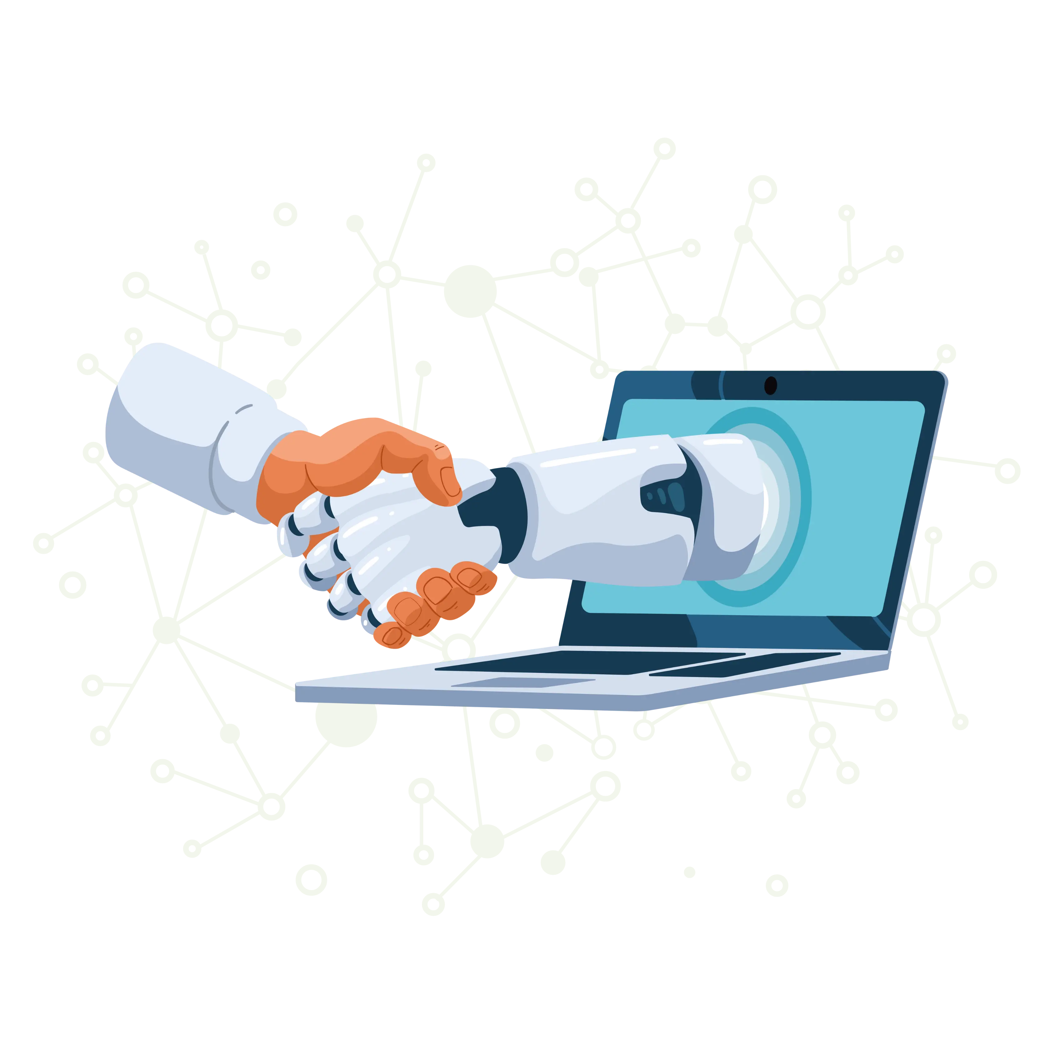
Leverage the Power of AI-Based Solutions for
Wellness Technology
Partner with us to unlock the full potential of AI-powered solutions to help businesses across various industries streamline operations, boost efficiency, and drive growth. Discover the endless possibilities of AI and enter a new era of technology solutions with us.


13 Years of Experience
Grow Your Business With Our Solutions.
iLeaf Solutions enables businesses to exceed customer and employee expectations with assurance. Our team of over 150 strategists, creatives, and experts develops and delivers cost-effective services that are rapidly deployable and user-centric. Our unwavering commitment to our values and mission propels us to become the highly esteemed strategic partner of choice for businesses.
Discover how
iLeaf can help Businesses
What We Do
We develop mobile applications, websites and custom software for businesses and inventive entrepreneurs who want to digitize operations, equip remote workplaces, integrate and upscale novel and legacy systems, or build something entirely new.
Business Strategy & Product Definition
The product planning strategy will address who the product will serve & how it will benefit.
Web Application
Development
Our team creates optimal web solutions based on cutting-edge technologies.
iOS & Android App Development
We use native and hybrid app solutions for all iOS and Android app development processes.
Quality Assurance & App Testing
Our QA team and app testers ensure the bugs are eliminated on time and optimized performance.
App Maintenance & Tech Support
Our error monitoring and tracking will allow us to fine-tune and make the app development more scalable.
Dedicated Development Team
With our dedicated team of developers, you'll receive 100% customized support, and more.
Why Work With Us
- Quality
Since our start, we have never compromised on quality.
- Time
We deliver orders on time when we receive them.
- Transparency
Professionalism is essential for being transparent at all levels.
- Innovative
We define our innovations by our strategies.
- Experienced
The best solutions will be delivered to you by our team of experts.
- Work Process
It is tailored to your business according to your requirements.
Unfiltered Client Experiences:
What our Clients Says
We are a large Swiss radio station in the German part of Switzerland. We try to handle as much development as possible without the use of an agency, but there are certain areas for which we don’t have the right abilities. In our case, we needed an Android application and don’t have any Java developers. I had worked with them before this on a private project. They did a very good job there, so we decided to give iLeaf Solutions a chance on our radio app.The Android app has achieved an impressive download count with a 4.5-star user rating, thanks to iLeaf Solutions’ high-quality code. Their rapid responsiveness and effective project structuring contributed to a successful engagement.

Sworkit was an app that motivated and rewarded the user for exercising. I was the co-founder and VP of engineering. iLeaf’s suggestions helped get the Android app featured in the Google Play store, leading to more users. iLeaf’s work had significantly fewer bugs than the iOS app; onlookers were shocked at the quality of the code and the relationship. iLeaf integrated with wearables before it was common.

iLeaf members are true professionals - through the past month we were working on a mammoth project and we’re more than satisfied with the results. The most pleasant way of our cooperation was the open and very professional communication which made it very enjoyable to work for such a big sized project. I fully recommend to work with them.

They were extremely conscientious and excellent communicators, always demonstrating a strong sense of responsibility and attention to detail in their actions and interactions. Their dedication to both their work and effective communication made them an invaluable asset to the team.

The developers and testers were very aware of our expected outcomes, and they always went beyond that. At every step, iLeaf delivered more than we expected, which I found very impressive. They were a great team to work with. I’d advise anyone that they are trustworthy and near-perfect technically. They’re a very good team.

We were looking for a permanent partner, and I am so glad that I found iLeaf Solutions.They allowed my inputs on the ideas that we developed together. They were very frank and it is been such a great partnership so far. Anybody who is looking for any digital platform for their business, I highly recommend them.

iLeaf Solutions consistently demonstrates exceptional professionalism, providing invaluable assistance and showcasing a well-structured business approach. Their development and design expertise have yielded two outstanding apps that garnered highly positive feedback from our target audience. The teams extensive systemic and programming knowledge, coupled with their technical proficiency, is evident in the exemplary deliverables they produce. We highly recommend iLeaf Solutions for their exemplary services and commendable project outcomes.

iLeaf Solutions displays a commendable degree of flexibility in their workflow, readily embracing new options when needed. Their responsive and adaptable approach expedites the delivery of high-quality, user-friendly solutions. Their efficient work processes and clear communication contribute significantly to the success of our collaboration, reflecting their commitment to delivering exceptional outcomes.

iLeaf Solutions is consistently helpful, readily providing detailed decks for discussions. Their database architecture is well-received, and they adeptly manage projects across time zones. They maintain thorough documentation and proactively address performance improvements, reflecting a commitment to excellence.


Let's Discuss
Business

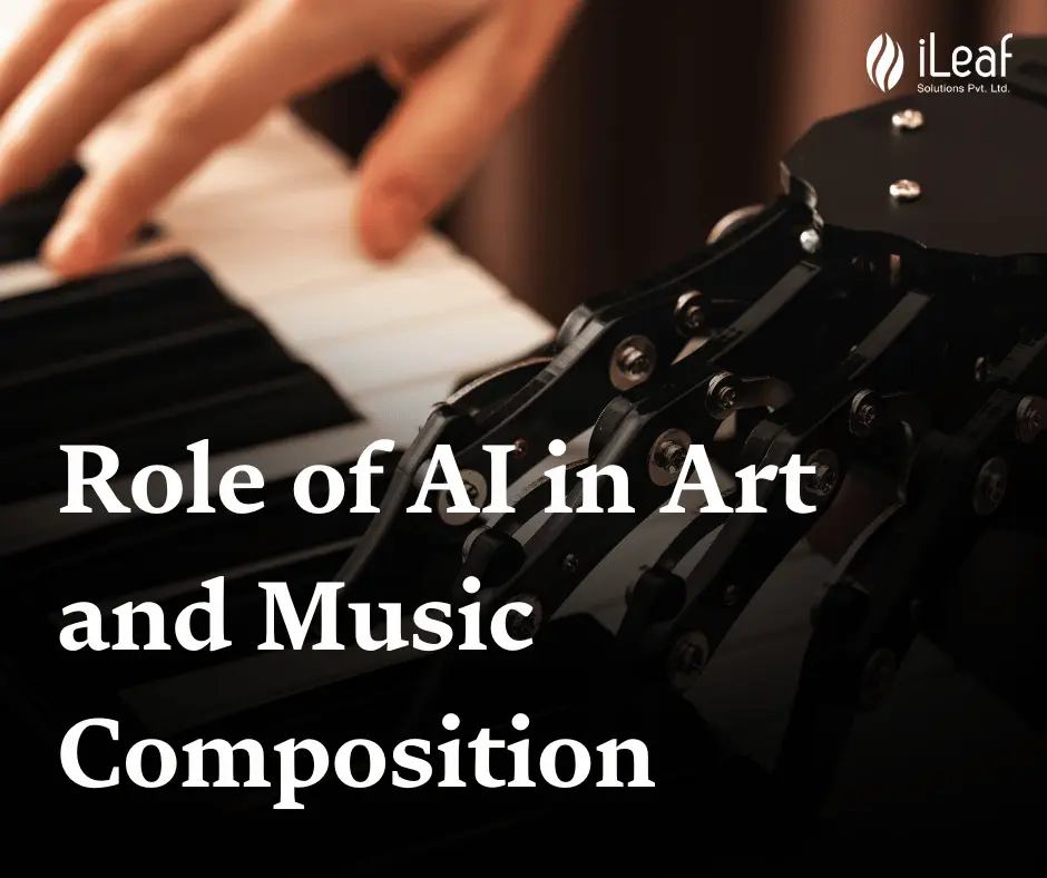
Latest Articles


